The new design on Proz.com Thread poster: Eli Knutsen
|
|---|
Eli Knutsen 
Norway
Local time: 12:31
Member (2016)
English to Norwegian
+ ...
The new design is so full of contrasts that it makes my eyes tired from using the page. I switched back to the old design today. It is so much more 'collected' and calmer to look at. It makes it much easier to find what you need. As a web designer, I do however question the choice of colours behind the text. Why not change to a light grey instead of the yellow. The yellow makes it look a bit outdated.
| | | | Tom in London
United Kingdom
Local time: 11:31
Member (2008)
Italian to English
Eli Knutsen wrote:
The new design is so full of contrasts that it makes my eyes tired from using the page. I switched back to the old design today. It is so much more 'collected' and calmer to look at. It makes it much easier to find what you need. As a web designer, I do however question the choice of colours behind the text. Why not change to a light grey instead of the yellow. The yellow makes it look a bit outdated.
I agree about the yellow - it was always wrong.
| | | | | Proz new design | Nov 28, 2022 |
Eli Knutsen wrote:
The new design is so full of contrasts that it makes my eyes tired from using the page. I switched back to the old design today. It is so much more 'collected' and calmer to look at. It makes it much easier to find what you need. As a web designer, I do however question the choice of colours behind the text. Why not change to a light grey instead of the yellow. The yellow makes it look a bit outdated.
I totally agree with you. Light grey put an amazing look to it instead of yellow.
| | | | | What service or page are you specifically referring to? | Nov 28, 2022 |
Hello Eli,
Eli Knutsen wrote:
The new design is so full of contrasts that it makes my eyes tired from using the page. I switched back to the old design today. It is so much more 'collected' and calmer to look at. It makes it much easier to find what you need. As a web designer, I do however question the choice of colours behind the text. Why not change to a light grey instead of the yellow. The yellow makes it look a bit outdated.
Are you referring to the new KudoZ design released in 2020? If so, please feel free to post feedback and suggestions for improvement on the related thread: https://www.proz.com/topic/340079
If you are referring to some other page or area, please let us know. Thanks!
Lucia
| | |
|
|
|
Samuel Murray
Netherlands
Local time: 12:31
Member (2006)
English to Afrikaans
+ ...
| Yellow is good | Nov 28, 2022 |
Eli Knutsen wrote:
Why not change to a light grey instead of the yellow. The yellow makes it look a bit outdated.
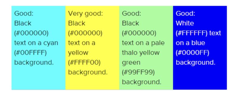
As a user, I don't care about whether something "looks old" or "looks new", but rather whether it is a pleasure to use. The black text on yellow background is actually much easier to read than black text on e.g. grey background would have been. To achieve the same legibility, if the background was grey, the text would have to be made thicker.
That said, #fafafa does look somewhat more classy... but it's less easy on the eye if you stare at it for a period of time:
[Edited at 2022-11-28 21:56 GMT]
| | | | | | | Vote of thanks | Nov 29, 2022 |
Samuel Murray wrote:
The black text on yellow background is actually much easier to read than black text on e.g. grey background would have been.
I agree. We should give the ProZ site managers a vote of thanks for leaving the old version accessible, and I hope they will continue to do so, so that I can continue to use it. "Oldie but goldie," as they say.
The worst is the modern tendency to use "grey on grey" as the default colour combination for blocks of text, making them barely legible. These old eyes struggle with that kind of thing. (Yes, I know there's a way around that.)
| | | | To report site rules violations or get help, contact a site moderator: You can also contact site staff by submitting a support request » The new design on Proz.com | Protemos translation business management system | Create your account in minutes, and start working! 3-month trial for agencies, and free for freelancers!
The system lets you keep client/vendor database, with contacts and rates, manage projects and assign jobs to vendors, issue invoices, track payments, store and manage project files, generate business reports on turnover profit per client/manager etc.
More info » |
| | TM-Town | Manage your TMs and Terms ... and boost your translation business
Are you ready for something fresh in the industry? TM-Town is a unique new site for you -- the freelance translator -- to store, manage and share translation memories (TMs) and glossaries...and potentially meet new clients on the basis of your prior work.
More info » |
|
| | | | X Sign in to your ProZ.com account... | | | | | |